Client: Concept project for Designerbriefs Challenge
Industry: Architecture Studio
Deliverables: Logo, Brand Identity System
Overview
Formade is a modern architecture studio that creates thoughtful, welcoming spaces for homes, offices, and public areas. Their design philosophy emphasises clean, practical aesthetics that help people feel at home.
The goal was to develop a brand identity that reflects Formade's core values: thoughtful, modern, and professional.
Concept
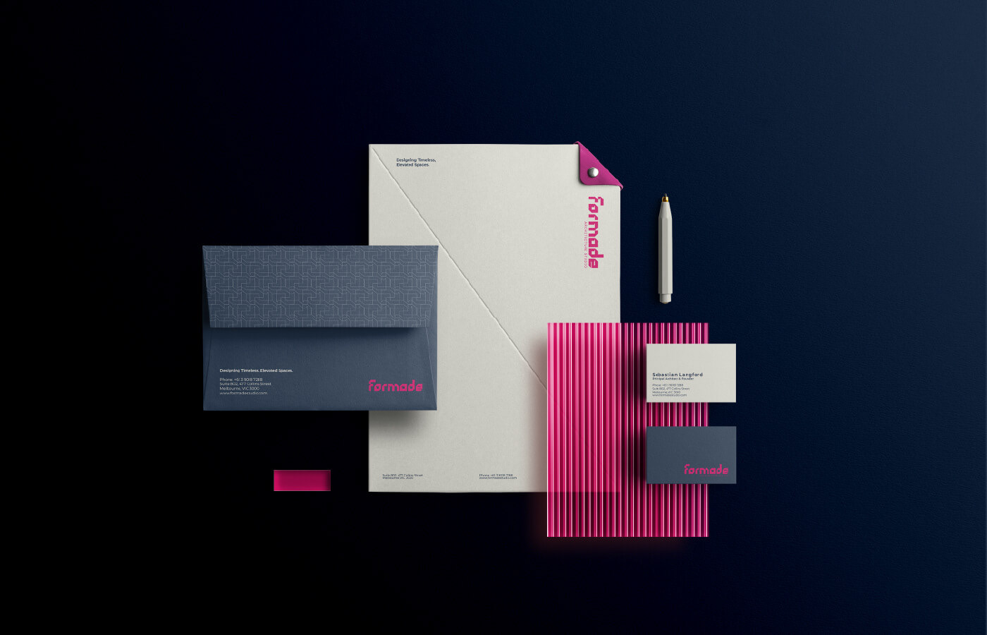
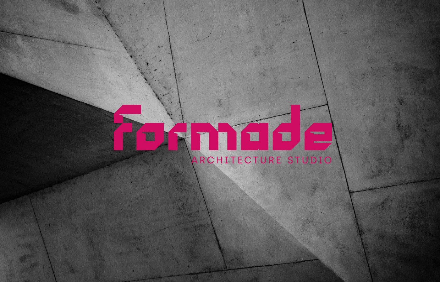
Drawing inspiration from thoughtful structure and modern living, the branding combines a bold yet sophisticated colour palette: vibrant magenta balanced by deep navy and soft cream.
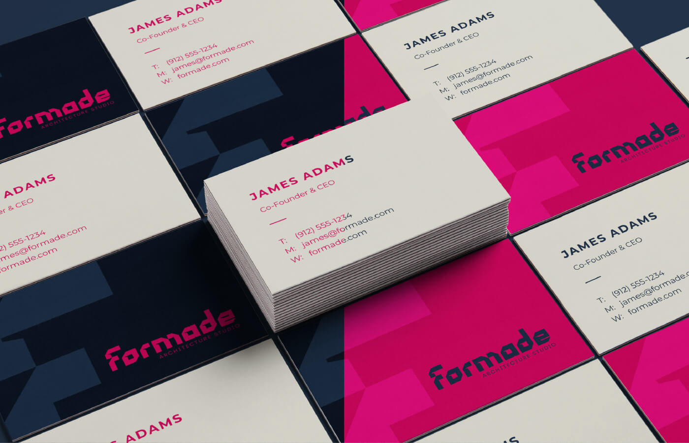
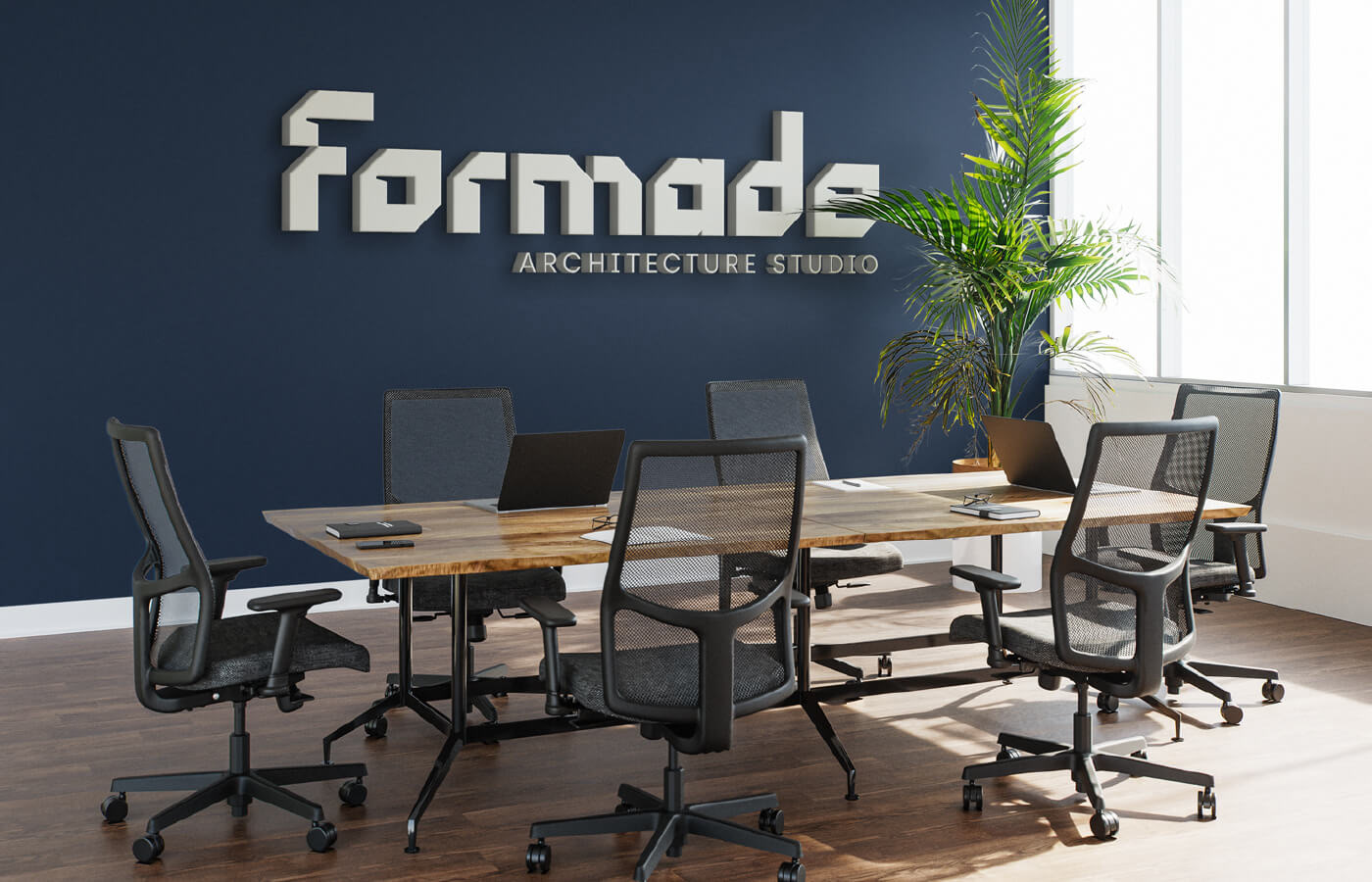
The logo showcases clean, geometric letterforms that feel architectural, structured, and approachable — embodying the studio's commitment to modern, human-centred spaces.
A custom geometric pattern represents connection, structure, and attention to detail — values central to Formade's work. This pattern appears across collateral to create texture and a cohesive visual language.
Deliverables
Logo design: Modern, geometric wordmark with strong personality
Color palette: Magenta (energy & creativity), Navy (professionalism), Cream (warmth)
Business cards: Bold layouts with strong color blocking to create memorable first impressions
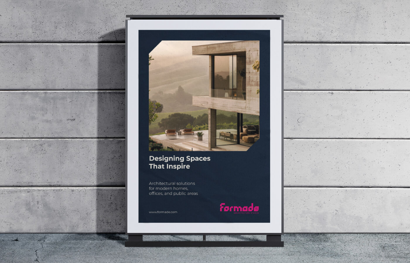
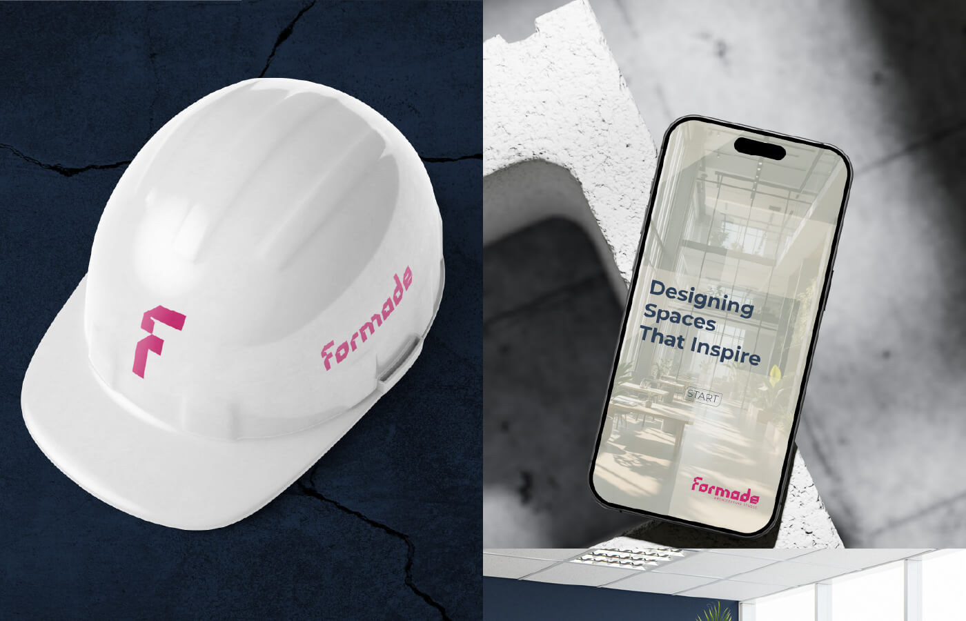
Brand applications: Poster, cap, mobile site, and office signage — ensuring a consistent brand experience across physical and digital spaces
Custom pattern: A versatile asset for backgrounds, stationery, and brand materials
Outcome
The final identity positions Formade as a forward-thinking, professional studio with a human touch. Vibrant accents inject energy and modernity, while structured layouts and patterns maintain a grounded, reliable, and elegant brand presence.